- Wednesday, 19 Dec 2012:
Accessibility Advent: enhance long drop downs
- Tuesday, 18 Dec 2012:
Accessibility Advent: beware focus events, redux
- Monday, 17 Dec 2012:
Accessibility Advent: please avoid being clever, particularly with form elements
- Friday, 14 Dec 2012:
Accessibility Advent: show jump links on focus
- Thursday, 13 Dec 2012:
Accessibility Advent: don't jiggle the layout
- Wednesday, 12 Dec 2012:
Accessibility Advent: think carefully before hiding possibilities
- Tuesday, 11 Dec 2012:
Accessibility Advent: don't punish errors
- Monday, 10 Dec 2012:
Accessibility Advent: preserve expected paging behavior
- Friday, 7 Dec 2012:
Accessibility Advent: beware focus events
- Thursday, 6 Dec 2012:
Accessibility Advent: give input elements sensible name attributes
- Published at
- Wednesday 19th December, 2012
(Throughout Advent I’m sharing some hints as to how web developers can make my life as a speech recognition user easier.)
A simple one today: if you have long drop downs on any of your forms, such as if you have to ask for my country, then please use progressive enhancement to turn it into a combo box.
The problem is that your ordering of items within a drop-down is going to be wrong. You can do clever tricks – look up my likely country using geo-IP, then pull the most likely other options to the top before dropping to alphabetic order (although note that if you provide too many options out of order you make it harder for people to find the correct entry) – but anytime you have a large number of options in a list someone is going to get the short straw and have considerable difficulty.
For me this usually happens because “United Kingdom” comes in alphabetic order after “United Arab Emirates”, but people sometimes instead list it incorrectly as “Great Britain”. So I might select the drop-down (which usually does not open it), and say “United”, which will either select “United Kingdom” (if it’s pulled out towards the top of the list) or “United Arab Emirates” (if it’s not). If the latter, saying “Kingdom” will probably end up with the right option being selected, although if it’s in the list as “Great Britain” then all bets are off.
Worse, if “United Kingdom” is in the list and was selected to start off with but I didn’t notice, saying “United Kingdom” can end up with either “Iran” or “Kiribati” being selected (basically down to how much space I leave between the two words, although sometimes it actually selects the correct option). And if Dragon misrecognizes what I say, anything could be selected. My easiest choice at that point is to force the drop-down to open if it hasn’t already (by saying something like “down arrow") and trying to figure out by eye what the correct option is, hoping it’s actually on screen.
With a combo box, I can just say “United Kingdom” and, if Dragon misrecognizes my speech, I can use normal speech correction commands to make things right. Validation against the list should come as late as possible, to avoid messing with this process.
- Published at
- Tuesday 18th December, 2012
(Throughout Advent I’m sharing some hints as to how web developers can make my life as a speech recognition user easier.)
I wrote previously about being wary of the blur event; this hint is kind of the opposite. When you’re binding keystroke event handlers, be very careful about where you bind them to. This, at least, is what I think is happening with Google Instant.
If you have a reasonably modern computer you’ll see Instant working: on a Google results page if you type changes to your search and Google is confident that the results match what you’re looking for then the results will be updated “instantly”.
I have to turn it off. (All credit to Google for making this possible.)
The problem is that Instant interacts poorly with Glee Box; if I bring up Glee Box (typically by pressing g) then anything I “type” into it also gets added to the Google search box. Then Instant kicks in a couple of seconds later and completely changes the search results (it also usually removes the Glee Box, for some reason).
Probably because Google uses the Google Web Toolkit extensively, it’s a bit too difficult to dig into it and figure out what’s actually going on here. But what I think is happening is that keystrokes are being captured by Google globally, probably using a handler on the document object. These are then manually being added to the search box, even if they were typed into something else. I may be completely misrepresenting what is going on, because that’s frankly insane.
There are situations where you want a keystroke handler bound to the document object; global keystrokes can be used to implement keyboard shortcuts in a web application, for instance. Google needs this on the search results page to implement keyboard navigation for search results. (Arrow keys moving through the different matches, for instance.) However when you want to do something clever with text typed into a specific box, you should be careful to make your handler only respond to keystrokes for the input element. (jQuery has a way of binding a keystroke handler to one element, but having it only respond to keystrokes from child elements matching a selector, which may help here.) Alternatively, you may be able to use a change event on the input element instead.
I’m not really convinced that Google is doing what I’ve outlined above; for instance, there seems to be a keyboard handler on the input element as well as on the document object. But whether they are or not, you should definitely be careful if building something similar.
- Published at
- Monday 17th December, 2012
(Throughout Advent I’m sharing some hints as to how web developers can make my life as a speech recognition user easier.)
If you want to be the opposite of helpful, why not try to be really clever and invent a completely new paradigm for a multistage process? Say, instead of using webpages, why not successively overlay different “form sheets” over the top of your actual webpage, so things like keyboard navigation through form elements have to go through everything in the original page before they get to the form you want someone to fill out?
If you do, you can enter the hallowed company of the Royal Museums Greenwich, where the only nice thing I can say about the experience is that pressing Escape closes the overlay.
There’s a nice “book now!” link (with correct alt text, meaning tools like Glee Box can find it), but instead of going to a new page it JavaScripts up an unsightly overlay. At this point it requires you to click a couple of links, and again Glee Box can manage this – but then you move to the second page:
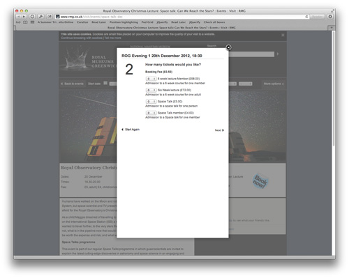
In Safari, Dragon has commands to move between only input fields ("next field” and “previous field"), which it does not have for Chrome (I believe because Safari provides a richer set of options via AppleScript). However this doesn’t help here, because behind the overlay there are still a load of input fields: a search box, and then separately a number of controls for filtering events by date. You have to advance through all of these before you get to the form controls you actually care about. (It’s even worse in Chrome, where you can only advance by tabbing; either you have to change the system setting so that tab advances only through form fields, or you just take even longer as you navigate through all the links on the page as well.)
This is basically a tabbing order issue. You could either set it explicitly, or you could just add your overlay at the beginning of the HTML document; you’re loading the content in it dynamically and then floating it over the top of everything else anyway, so I’m not convinced there’s a downside. Or, of course, you could just build separate pages. Unless your backend system is utterly messed up it should be pretty much as fast anyway, and you won’t have to bother creating or stealing a “loading” spinner – the browser has one already nicely built into it.
- Published at
- Friday 14th December, 2012
(Throughout Advent I’m sharing some hints as to how web developers can make my life as a speech recognition user easier.)
Lots of sites provide a “jump to content” link designed for screen readers and the like; there often may be other jump links, to navigation, user tools and so on. Most people will then hide the links visually, typically by positioning them off the viewport, say using { position: absolute; left: -9999px; }.
A couple of sites go further, and show the links again when they are focused. Here that is on Mother Jones; hit tab a couple of times and watch the top right corner.
Here’s why I like it: although you can see the focused anchor target in the status bar in most browsers, it may not be visible depending on configuration, and more importantly you can style it to fit in with your site. Some people won’t look at the status bar at all, and most people are going to be more attentive to your content – within the viewport – than to the browser’s chrome.
The way Mother Jones uses can be implemented in CSS, but we can go further with a tiny bit of JavaScript and show the entire set of jump links when any one is focused, using a single line of jQuery or slightly more pure JavaScript. Then you can do more sophisticated styling, including pushing the entire site content down, which sounds like it goes against yesterday’s advice but which I’d be okay with because tabbing is a keyboard operation, so you’re not going to confuse someone in the middle of a mouse operation by doing this. It’s also obvious, unmissable – and that’s helpful.
Why does this matter? I tend to use Glee Box to navigate links by voice, but sometimes it doesn’t work, or there are too many links with the same anchor text, or I want to read a long article opening links as I go. Making it easy to skip focus past your header and navigation is just as useful for me as for the other potential audiences of those jump links.
Dragon Naturally Speaking on Windows allows you to speak voice links natively, so you don’t require a plug-in like Glee Box; however the same issues can arise, particularly many links on a page (Dragon will only respond to a certain number, to avoid taking too long and getting in the user’s way) and the desire to open links while reading long articles.
- Published at
- Thursday 13th December, 2012
(Throughout Advent I’m sharing some hints as to how web developers can make my life as a speech recognition user easier.)
Another problem caused principally by the relative difficulties of driving the pointer by voice compared to with a mouse or tablet: please don’t let elements of the layout move.
It’s surprising how many reasons people think they have for moving elements around the page. Advertising banner stripes that push down the entire page, but are not of the same height from page to page; emphasizing buttons on rollover in a way that changes the size and so forces the entire navigation bar to layout differently. Things that slide out on rollover, and then require you to move away before they disappear, to get to something alongside the original trigger area.
These are really two different problems. The first is when, once a page is loaded and rendered, moving the pointer around on that page will move things around. This may be due to poor implementation (if you apply a bold style to text buttons on rollover, for instance, you need to do something to stop them from changing size), but increasingly people are deliberately opening menus and utility panels on rollover. If you have a series of them, you need to be very careful that panels you open don’t conceal the hit zones to open other panels – or, maybe, open them only on click. Even worse, there are sites that slide down a notification bar – “you have received the using this site for 10 minutes badge!” – right over the top of the navigation bar.
In both cases, a mouse user can backtrack the pointer quite easily to let the pop-up close; if a Dragon user is in the middle of using MouseGrid, at best they can use relative mouse movement to duck the pointer out of the way and back again, without closing the MouseGrid. However you also disrupted the process of using MouseGrid, which is to iteratively move the pointer closer to the thing you want to click on – if the visible context you are using to guide this process changes underneath you, it’s easy to lose track of what’s going on.
The other problem is when moving through a series of pages on a single site, having set the mouse pointer at the right place to advance by one page (such as with a piece of longform journalism split across several pages). Everything is fine here unless the vertical position of whatever we have to click on changes page by page. This can either happen if story navigation is only beneath the text (since the text is unlikely to fill exactly the same vertical height on each page), or – as I’ve seen a lot recently – if there is unrelated content above the story navigation somewhere, such as a large image banner for other content on the site, and that is not a standard height. (Say what you like about Internet advertising, it does at least have standard sizes.) There is also the possibility of elements moving horizontally, although this is rarer – the only example I can think of is where I want to hit “next” in the pagination controls, but they are centered or left aligned and do not contain every page (so they may show 1-2-3-4-5-Next on the first page, but 2-3-4-5-6-Next on the second page; with proportional fonts, the “next” link will move around).
It is, however, generally okay to move things around when I do something deliberate, either by clicking or by a keystroke. There’s a clever trick I’ve seen once or twice recently which does just this specifically for users of some assistive technologies (and possibly also keyboard), which I’ll write about tomorrow.
- Published at
- Wednesday 12th December, 2012
(Throughout Advent I’m sharing some hints as to how web developers can make my life as a speech recognition user easier.)
I wanted to write today about how you should generally mark draggable targets. I hinted in a previous article that voice users can perform drag actions; it sounds something like “Mouse Grid / 1 / 3 / 7 / Press Mouse / Close Mouse Grid / Mouse Grid / 9 / 4 / 3 / Release Mouse / Close Mouse Grid”, so it’s a little lengthy but not terribly cumbersome providing your drag targets are fairly big.
In my notes I’d written “Gmail does this well”. I looked today. No it does not.
To add attachments in Gmail you either drag them into the compose area, which makes logical sense but isn’t particularly discoverable, or in the old compose interface you drag them to the line that contains the “Attach a file” option, which is kind of semi-guessable if you know that Google like implementing draggable targets for files (you can drag files into Google Image Search as well; again, there’s no hint on the page that this is possible). As previously discussed, as a voice user I’m unlikely to speculatively move the mouse around in case you happen to have implemented a useful feature. (However I don’t strictly need to, as there’s a traditional button interface to adding attachments in GMail; also, Dragon Naturally Speaking on Windows is supposed to have better built-in support for Gmail than Dragon Dictate for Mac.)
The more general issue here is one of discoverability, which is a long-standing interface design problem, sometimes thought of as a tradeoff between the interface being too busy and helping the user learn how to use it. There’s an interesting article discussing clutter versus discoverability by John D. Cook (which I’d recommend checking out even if you don’t care about this because it’s got a picture of a nice sailing vessel at the top).
My traditional position on this has been that simple features should be highly discoverable, but complex or expert features can be hidden and require reading documentation to find them. By this guideline, Gmail is actually doing the right thing — attaching files to an email is a rarely-used feature, and in any case there’s an entirely discoverable interface option to do it. (There isn’t a keyboard shortcut for it, however, which is a shame; it means that expert mouse users get better support but expert keyboard users do not.)
However if I had started using Gmail only by voice, there’s a good chance I would never have discovered that I could drag and drop attachments, which even with the MouseGrid dance is often faster than having to navigate the file system through the “open” dialog (which tends to involve a lot of tabbing backwards and forwards between different controls to get where you want to go).
To take full advantage of all web technologies these days requires considerable development time, so – particularly for startups – there’s a good chance you won’t have got to all the details yet. That means I’ll probably assume you haven’t done sophisticated things such as dragging files into your web application, unless you make it obvious. On the other hand, for rare operations there’s a decent argument for not shouting about it.
Simple advice: there isn’t any here. You’re going to have to think, and think carefully. (It’s an interface issue, there’s really no getting away without thinking.)
- Published at
- Tuesday 11th December, 2012
(Throughout Advent I’m sharing some hints as to how web developers can make my life as a speech recognition user easier.)
All users make errors; depending on tiredness, concentration, complexity of task, and so on people can make input errors using keyboard, mouse, voice or whatever. I find that my input error rate is significantly higher by voice, sometimes due to ways the voice system doesn’t quite match up with the way an application works, sometimes due to plain recognition errors where Dragon thinks I said something else, and sometimes due to user error (I think the most common one for me is to dictate text while in Spelling Mode, which means Dragon spins for a while trying to figure out what letters I said and then blasts line noise into whatever has focus).
I’m okay with making errors; that’s just going to happen. But please, please, please don’t punish me for those errors. Here’s one way you should avoid: one form with multiple different things I have to get right.
I came across this while registering for the Santander online banking system, which manages to break almost every rule I could consider writing to make voice users’ lives easier. One, large, scrolling form rather than several sequential requires concentration for longer; I can feel myself getting tired with having to navigate around a large form trying to get all the inputs right. What’s worse than that is that a single form tends to get validated all at once, and either passes or fails. So something like this is bad:
In an earlier step I’d had to input a temporary ID code and pass phrase, which was bad enough (because they were all numbers, and triggered the leading space problem and the US phone number formatting problem as previously discussed). To then have to create two new ones, which of course had requirements such as length and use of punctuation characters, and repeat them, was a huge effort. (Even creating them in a temporary document separate from the web browser and copying them in, which is what I did eventually, is a pain, because switching back and forth to select two different pieces of information is time consuming and runs the risk that you don’t actually copy the second one, pasting the first into all boxes.)
And they’d made it even worse, of course: if you got anything wrong, even the correct values weren’t carried onto the form again. (This was also true of entering the temporary ID and pass phrase, if I remember correctly.) So I’d get the ID code right, twice, but mess up getting the confirmation pass phrase, and then have to do the whole lot again. I got it wrong I think three times in total. If this had been split into two separate steps, setting the ID code and pass phrase on different screens, it would have been much easier.
By the time I’d finished registering I was sufficiently frustrated I just transferred most of my money out of Santander into an account with a bank that has a somewhat more usable online banking interface. If it’d been for anything where I didn’t already have a vested interest, I’d have given up.
So please don’t punish errors; any error I make I should be able to correct independently of any other information I give you. (Another example: if you build one form for shipping information and payment, don’t clear the shipping address if I put in a credit card number that doesn’t validate, and vice versa.)
Also, consider very carefully whether you actually need confirmation of anything the user inputs. For passwords, you should never have to (password reset to the email address on file will work); I’d argue that for banking registration codes you don’t have to either, because I can always get you to send temporary ones out by post. Email addresses, however, probably are important to confirm; anecdotally I saw a fair number of typos in Artfinder signups while I was there (as well as a fair number of deliberate bad emails, but you’re not trying to avoid them by having them input twice).
- Published at
- Monday 10th December, 2012
(Throughout Advent I’m sharing some hints as to how web developers can make my life as a speech recognition user easier.)
I want to introduce you to two of my favorite keys: page up, and page down. Press one and you advance one window-full in your web browser, press the other to go back and reread.
This may seem obvious, even superior of me to point it out. But the number of sites that mess this up is impressive. Here’s one: Pando Daily. I like what Pando’s doing, but when I read one of their articles here’s what it sounds like: “Next page. Up arrow. Up arrow,” then a long pause before repeating.
Why? I blame it on television.
Television, particularly US broadcast, uses a technique called a lower third to provide more information from the broadcast network, these days often including advertisements for upcoming programs while you’re watching another. It obscures a chunk of what you’re trying to see, with variable benefits (some studies show utility in summarizing the current news story in the lower third, for instance – although increasingly if there’s a news story there, it’s a different one to whatever the presenter is talking about).
Lower thirds have leapt into the web space with – perhaps surprisingly, given the radically different technologies – the same problem. (On the web, they’re mostly being used for navigation, social links and – inevitably – advertising.) If you slap something over a scrollable area, paging that area will effectively skip the content originally underneath your floating layer:
This isn’t a problem when using the scroll wheel on a mouse or graphics tablet, or two finger scrolling on an Apple trackpad, or one finger scrolling on a touch device. But all of those are less efficient than just hitting a single key.
What can we do? Dragon has commands to advance by only half a page, but that’s not a big improvement because I don’t know where the half page boundary is, so I read to the bottom, half page advance – then I have to find my place again. Full-page advance and starting again at the top of the window is easier, and it’s a wash (but with lower cognitive load) if I have to scroll back a bit each time.
The floating layer could be moved out of the way of the content – to the side, say. That’s not always possible, depending on design.
Or – radical thought – web developers could make just the content area scrollable, so the fixed layer doesn’t obscure it:
This results in two scrollable areas (content and page), but Mac OS will now hide the scrollbars if you have a suitable scrolling device attached (or you can hide them always), so it’s less messy than it used to be. Anyone know if Windows 8 has gone in that direction too?
- Published at
- Friday 7th December, 2012
(Throughout Advent I’m sharing some hints as to how web developers can make my life as a speech recognition user easier.)
You know that thing with web Twitter where you hit “reply” on a Tweet and the compose box slides out? Yeah, I hate that.
This is a Dragon-specific issue. The way that Dragon’s dictation system works is that it keeps a “cached” view of what you’re editing inside Dragon, to avoid hitting the accessibility layer of the operating system all the time (it also enables some editing features that wouldn’t otherwise be possible). As you dictate, it updates its cache and issues commands to the application to update the real copy at the same time. The trouble is, under a range of common situations these two views get out of sync, necessitating a special command to force Dragon to update the cache. Worse, it (and what I assume are some other bugs or problems between Dragon and the various applications you want to use) result in errors in the “real” copy in the application – spurious characters, usually.
Dragon’s response to this, as of this year’s release, is the Express Editor, which you can open anywhere, get Dragon’s full dictation and editing facilities without the inter-application problems, and then transfer the text from the Express Editor back into whatever you were using before – in this case a web browser with Twitter open.
That’s where things go wrong with Twitter replies, because when the browser window lost focus (so the Express Editor could grab it) Twitter helpfully collapsed the reply box to a single line – the same as if you’d clicked off it – and in so doing lost the focus on the input element. When the Express Editor subsequently tries to transfer its text back in, the focus is nowhere useful and you lose the text entirely.
Twitter have clearly designed this feature with care – once you start typing your reply, for instance, the input won’t collapse and lose focus. So this particular issue would be unlikely to occur to anyone who didn’t actually use Dragon.
What could Twitter do to fix this? I think that what’s happening is that they’re doing the collapse/unfocus on the blur event from the text area input. This is easier than binding a click handler to the document and making clicks outside the composition area perform the collapse/unfocus. The only differences I can think of are with switching away from the tab or application, which is what causes my problem, and if a browser plug-in takes focus within the same tab. I can’t think of a situation where a plug-in that grabs focus triggering composition area collapse would be a problem, but I also can’t think of a reason why not doing it would be a problem either.
The advice here? Blur events happen for reasons you may have forgotten about. Think carefully about how your site should behave when that happens.
- Published at
- Thursday 6th December, 2012
(Throughout Advent I’m sharing some hints as to how web developers can make my life as a speech recognition user easier.)
Autocomplete is my friend; things like email addresses are a pain to dictate. I could create a “word” in the Dragon vocabulary for each one I use, but it is vastly easier these days to let my web browser take care of it.
This does require that you play along, however. Use expected names for form inputs wherever possible. (They are scoped by the form itself, so collisions for the fields most likely to benefit from autocompletion won’t be a problem in most situations.) While we’re here, quit asking me to confirm my email address – because that second field usually doesn’t autocomplete.
What do you mean your inputs don’t have name attributes? Facepalm.
There’s a service called Launchrock that lets you take prelaunch interest by collecting emails. It’s simple. It’s cute. It doesn’t work.
Here’s what a keyboard user experiences: an email box plus some shiny information about whatever forthcoming service they are signing up for. Tap tap tap, email entered. Next field: choose a password. (It seems to support other fields, such as name, as well.)
Here’s what I get: the same email box and information. Great; email boxes I can just get the first character into, then up pops the autocomplete list and I select the one I want, which will usually be at the top.
“Press the key Juliet.”
Odd. The “j” is there, but no drop-down. Okay, maybe it triggers on two characters…
“Press the key Alpha.”
Still nothing. At this point I tend to give up. Seriously. Your site hasn’t launched, and when you do it will probably have Twitter or Facebook sign in, so there’s rarely much advantage in getting in early – and someone is bound to tell me about it again. If you’re really lucky, I’ll remember I’d heard of you before. And… I’m gone.
Launchrock’s developers are being clever, progressively revealing fields on a single page using JavaScript. Presumably at some point this gets submitted via Ajax. Apparently they forgot to build the non-JavaScript version first, or even at all; if they had, the inputs would have names, autocomplete would work and I’d be happy.
Please don’t do this. Build it right. (Apparently you can customize Launchrock’s HTML. Do so.)
